Data Storytelling touching our daily life…
When I was reading the newspaper and the below visual caught my attention. The finest part of the visual along with the data was that it was self-explanatory. This made me think as a storyteller that it might not always be a case that every time, we need a story to present out data or we in person have the opportunity to present the data on offline or online mode quite similar to how I was just simply reading it.
How do you help people making the data more relevant and meaningful weaving a narrative around the data elements?
Elements of Data Storytelling applied in the attached TOI report:
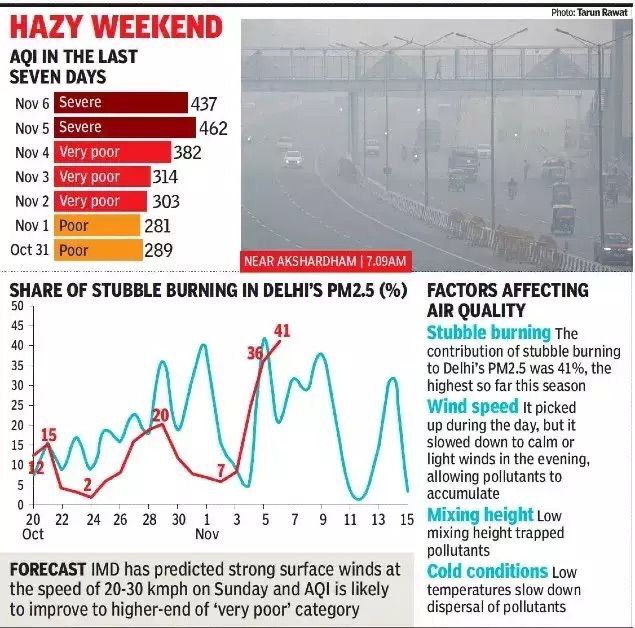
Time & Place Marker: Data & facts regarding air pollution and prevalent air quality in Delhi, ncr and northern India on various days one week before Diwali.
Humanistic Approach: Factors affecting the air quality gives a relevant argument to readers that the amalgamation of Stubble burning, weather conditions and wind speed which have contributed to the plummeted air quality giving a meteoric rise to air pollution.
Call to action: The forecast gives a clarity to readers what they should be prepared for in the coming days, weeks. Along with numbers a meaningful and relevant visual help to catch the attention of the reader and visualize the alarming situation thereby creating a sense of urgency required to address it.
People can relate to numbers better if there is a context build around those number which helps them to understand and further take an action.
Data Storytelling comprises of building context for communication by understanding the audience, adding a visual design – an imagery along with the data – the accurate representation to help viewers and adding all the information in an intriguing & engaging way to help understand easily.
Published by Monika Tandon